Add KPI numbers, bar charts, pie charts, tables, and more – connected to your Odoo data.
Overview
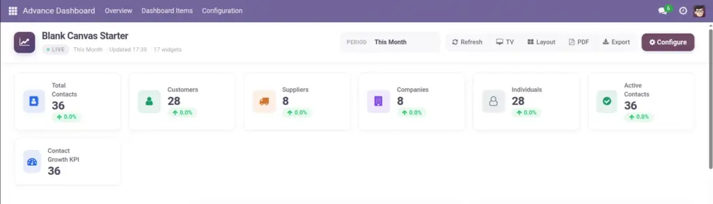
Widgets are the building blocks of your dashboard. Each widget shows one piece of information – a single number, a chart, or a table of records. Advance Dashboard supports 15 widget types including KPI tiles, bar charts, line charts, pie charts, gauges, progress bars, sparklines, and data lists.
How It Works
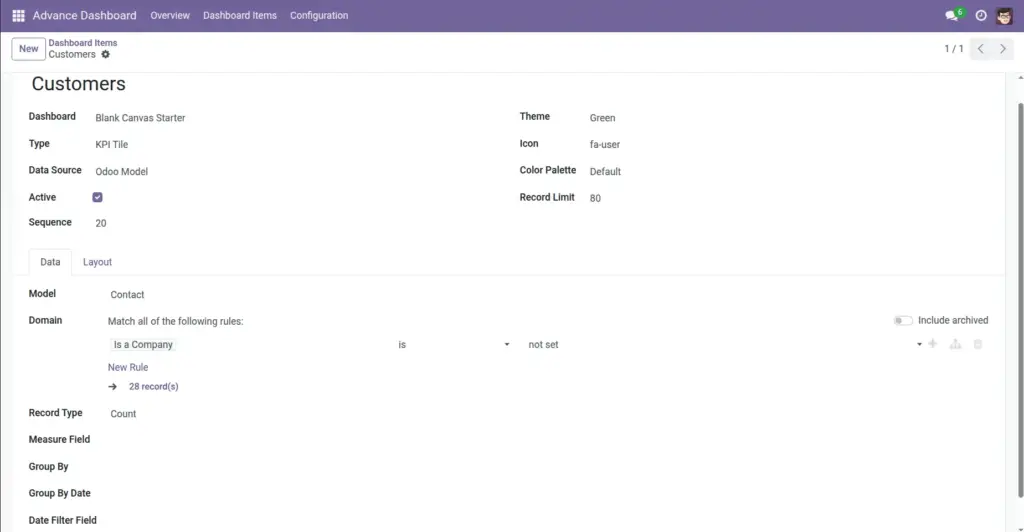
Every widget pulls data from your Odoo database. You choose a data source (an Odoo record type like Sales Orders or Employees), set what to measure (count, sum, or average), and optionally group the results (e.g., by month or by salesperson). The dashboard engine runs the query and displays the result as a chart or number.
Step-by-Step Guide
Open Your Dashboard
- Go to Overview, open your dashboard form, and click the Items tab.
Add a New Widget
- Click Add a line and give your widget a name like “Total Sales This Month”.
Choose Widget Type
- Select KPI Tile for a single number, Bar Chart for comparisons, List View for a table, etc.
Pick the Data Source
- Choose “Odoo Model” and select the record type (e.g., Sale Order, Employee, Invoice).
Set the Calculation
- Choose Count (how many records), Sum (total of a amount field), or Average.
Choose a Measure Field
- For Sum or Average, pick the numeric field (e.g., “Total Amount” on sales orders).
Group By (for charts)
- Pick a field to split the chart (e.g., group sales by “Salesperson” or by “Order Date” per month).
Set Size on Grid
- Set Width (1–12 columns) and Height (1–4 rows) to control how much space the widget takes.
Open Dashboard to Preview
- Click Open Dashboard to see your widget live. Drag to reposition, resize by dragging corners.
Click to Drill Down
- Click a widget to open the underlying Odoo records that make up the number or chart.
Widget Fields
| Field Name | Description | Example |
|---|---|---|
Widget Name |
Title shown on the widget |
“Revenue This Month” |
Widget Type |
Visual style – tile, chart, list, gauge, etc. |
KPI Tile, Bar Chart, List View |
Data Source |
Where data comes from |
Odoo Model or Custom SQL |
Model |
The Odoo record type to query |
Sale Order, Employee, Invoice |
Record Type |
How to calculate the value |
Count, Sum, Average |
Measure Field |
Numeric field for Sum or Average |
amount_total on Sale Order |
Group By |
Field to split chart data into segments |
Salesperson, Product Category |
Group By Date |
Time interval when grouping dates |
Day, Week, Month, Quarter, Year |
Date Filter Field |
Which date field to filter on |
Order Date, Create Date |
List Columns |
Fields shown in a List View widget |
Customer, Amount, Status |
List Layout |
Visual style for list widgets |
Cards, Striped, Compact |
Colour Palette |
Chart colour scheme |
Default, Cool, Warm, Neon |
Theme Colour |
Background colour of the widget card |
Blue, Green, Purple |
Icon |
Small icon shown on KPI tiles |
Chart icon, money icon |
Gauge Target |
100% mark for gauge widgets |
Target = 100,000 for sales goal |
Width / Height |
Size on the 12-column grid |
Width 6, Height 2 |
Record Limit |
Maximum rows shown in charts and lists |
80 records |
Field Explanations
Widget Name
The label displayed on the widget. Make it clear and action-oriented – “Open Invoices” not “Widget 1”.
Widget Type
Determines how data is displayed. Use KPI Tile for one big number, Bar Chart for comparisons, Pie Chart for proportions, List View for detailed records.
Data Source
“Odoo Model” uses built-in record types (recommended for most users). “Custom SQL” lets managers write database queries for advanced needs.
Model
The type of Odoo record to query. Examples: Sale Order for sales data, hr.employee for staff, account.move for invoices.
Record Type
Count = how many records match. Sum = add up a numeric field. Average = mean of a numeric field.
Measure Field
The numeric field to sum or average. Only needed when Record Type is Sum or Average. Example: “amount_total” on sales orders.
Group By
Splits chart data into categories. A bar chart grouped by “Salesperson” shows one bar per salesperson.
Group By Date
When Group By is a date field, this sets the interval – daily, weekly, monthly, etc.
Date Filter Field
Which date field the dashboard’s date picker filters on. Example: “date_order” for sales orders.
List Columns
For List View widgets – which fields appear as table columns.
List Layout
Visual presentation of list data – cards, striped rows, compact table, project cards, or timeline rows.
Colour Palette
Sets the colours used in charts. Choose one that matches your dashboard theme.
Theme Colour
Background colour of the widget card itself – blue, green, red, etc.
Icon
A small icon displayed on KPI tile widgets. Helps users quickly identify what the number represents.
Gauge Target
For gauge and progress bar widgets – the value that represents 100%. If target is 100,000 and actual is 75,000, the gauge shows 75%.
Width / Height
Widget size on the grid. The grid has 12 columns. Width 6 = half the screen. Height 2 = double the default row height.
Record Limit
Maximum number of data points or rows returned. Prevents very large charts from slowing down the dashboard.
Tips
- Start with a KPI Tile to show one important number, then add a bar chart grouped by month to show the trend.
- Click any widget on the live dashboard to drill down into the actual Odoo records behind the number.
- Use List View widgets for “top 10” tables – e.g., top customers by revenue this month.
- KPI Comparison widgets show the current value alongside the previous period with a trend arrow.
Common Mistakes
- Choosing Sum without selecting a Measure Field – the widget will fall back to counting records instead.
- Forgetting to set a Date Filter Field – the dashboard date picker will not affect the widget’s data.
- Making widgets too small (Width 1) for charts – bar and line charts need at least Width 4 to be readable.
- Using Custom SQL without manager permission – only Dashboard Managers can create SQL widgets.
Image