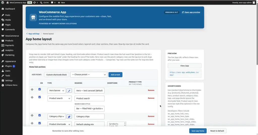
Design your app homepage row by row – drag to reorder, toggle each section on or off, choose from 30+ built-in content types, and save with a single button. What you build here is exactly what customers see when they open /app.
Where to Find It
Location: Go to WooCommerce → App and click “Home Layout” on the hub page. Or navigate directly to WooCommerce → App → Home Layout.
How the Editor Works
The Home Layout Editor is a row-based editor. Each row you create becomes one visible section on the /app homepage. Rows stack from top to bottom – the first row in the list is the first thing customers see when they open the app.
Each row in the editor table has these controls:
| Column | What It Does |
|---|---|
⠿ Drag handle |
Click and drag this handle up or down to change the position of the row on the homepage. Rows are displayed in exactly the order shown here. |
On (toggle) |
A checkbox to enable or disable this row. When unchecked, the row is hidden from customers on /app but stays saved – useful for seasonal content you want to turn on later. |
Type |
A dropdown that sets what kind of content this row shows. This is the most important field – see the full list of types below. |
Heading |
The section title text displayed above this row on the homepage – for example “Best Sellers”, “New Arrivals”, “Shop by Category”. Leave blank to show no heading. |
Shortcode |
A WooCommerce shortcode to render in this row. Only used when Type is set to “Custom shortcode block”. Example: |
Product type |
Visible only on “By type” rows. Filters the product grid to show only products of a specific type (e.g. simple, variable). |
Delete button |
Removes this row from the layout. This cannot be undone until you use “Reset to default”. |
Adding New Rows
At the top of the row table there is an “Add rows” toolbar with two ways to add content:
| Button / Control | What It Does |
|---|---|
“Custom shortcode block” button |
Adds a blank row pre-set to “Custom shortcode block” type. Use this when you want to paste a WooCommerce shortcode like |
“Choose preset” dropdown |
Select any of the 30+ built-in content types from the dropdown list. These are pre-configured blocks like “Best sellers”, “New arrivals”, “Category chips”, etc. |
“Add preset” button |
After selecting a preset from the dropdown, click this button to add it as a new row at the bottom of the layout. |
All Available Row Types
The Type dropdown in each row contains all content types you can add to your homepage. They are grouped here by category:
Hero Banners (Top banner / slideshow)
| Type | What It Shows |
|---|---|
Hero – text carousel |
A swipeable headline carousel at the top of the homepage. Text slides (heading and button text) come from your Hero banner settings. This is the default hero style. |
Hero – image carousel |
A swipeable strip of featured product images. Images are pulled from your featured products. |
Hero – single promo card |
One large classic promotional block – a single strong headline and call-to-action. Uses filter defaults or your Hero settings. |
Hero – minimal strip |
A compact headline bar with a “Browse now” style link. Takes up very little screen space – good for stores that want a banner without it dominating the page. |
Hero – split (image + text) |
Product image displayed beside headline text slides – half-and-half layout. More visual impact than text-only while staying clean. |
Hero – promo card strip |
Swipeable gradient promotional cards – each card has copy on the left and product art on the right. A bold eye-catching style for promotions and sales. |
Search & Navigation
| Type | What It Shows |
|---|---|
Product search |
A search bar that submits to /app/search. You can place it anywhere on the homepage – its position in the editor list = its position on screen. There are 5 bar style options configurable per row in the row settings. The Heading and Shortcode fields are ignored for this type. |
Category chips |
A horizontal row of tappable shortcuts to your product categories. Customers tap a chip to jump to that category’s product page. You can configure which category slugs appear and whether chips show text only or image + text (images come from Products → Categories). |
Tag chips |
Same as Category chips but for product tags. Horizontal row of tappable tag shortcuts. Configure which tag slugs appear using the tag icon in the row. |
More (pages) |
A list of your WordPress pages shown as tappable links – useful for About, Contact, FAQ, and Blog pages. |
Product Rows – By Status / Feature
| Type | What It Shows |
|---|---|
Featured products |
Products you have marked as “Featured” in WooCommerce (Products → Edit product → check Featured). |
On sale |
Products that currently have a sale price set – shown by popularity order. |
Newest on sale |
Products that are on sale, sorted newest first (most recently added sale items). |
Featured deals |
Products that are BOTH marked as Featured AND have a sale price – the best of both lists. |
New arrivals |
Your most recently published products, sorted by publish date descending. |
Best sellers |
Products with the highest total units sold, sorted by sales count. |
Top rated |
Products with the highest average customer review rating. |
Random picks |
A randomly shuffled selection of products. The products shown change on each page load – good for variety. |
Discover more |
A larger grid of 12 random products – gives customers more to explore in one scrollable section. |
Default catalog mix |
The standard WooCommerce product list in the default shop ordering – a safe general-purpose row. |
Product Rows – By Sort Order
| Type | What It Shows |
|---|---|
Price: low to high |
Products sorted from cheapest to most expensive. Good for budget-conscious shoppers. |
Price: high to low |
Products sorted from most expensive to cheapest. Good for showcasing premium items. |
Alphabetical A–Z |
Products sorted alphabetically by title. |
Shop / order ranking |
Uses WooCommerce “menu order” – the custom sort order you set manually in the Products list (drag to reorder). Good for curated, hand-picked ordering. |
Recently updated |
Products sorted by the date they were last edited – shows items you have recently updated or refreshed. |
Product Rows – By Product Type
| Type | What It Shows |
|---|---|
Simple products |
Only products of WooCommerce type “Simple” – straightforward single-variation products. |
Variable products |
Only products with variations (e.g. products with size or color options). |
Grouped products |
Only WooCommerce “Grouped” product records. |
External / affiliate |
Only products linked to external URLs (affiliate products). |
Product Rows – By Visibility
| Type | What It Shows |
|---|---|
Catalog-only visibility |
Products set to “Catalog” visibility in WooCommerce – these appear in the shop catalog but are hidden from search results. |
Search-only visibility |
Products set to “Search” visibility – visible in search but hidden from the main catalog. |
Custom Content
| Type | What It Shows |
|---|---|
Custom shortcode block |
Free-form content rendered from any WooCommerce shortcode you enter in the Shortcode field. Examples: |
Saving & Resetting
| Button | What It Does |
|---|---|
Save app home |
Saves the entire layout – all rows, their order, On/Off states, headings, types, and shortcodes. The live /app homepage updates immediately after saving. |
Reset to default |
Resets the entire home layout back to the plugin’s factory default rows. A confirmation pop-up appears before the reset happens. Useful if you want to start fresh. |
Always save after editing. If you drag rows, add rows, or edit row settings and then navigate away without clicking “Save app home”, all your changes will be lost.
Tips for a Great Homepage Layout
- Put your most compelling content first – customers decide in seconds whether to keep scrolling. A Hero banner or a “New Arrivals” row at the top grabs attention immediately.
- Follow the hero with Category chips – they help customers navigate to exactly what they are looking for in one tap, without scrolling the whole catalog.
- Add a Product search row near the top – many mobile shoppers know what they want and prefer to search directly.
- Keep it to 4–6 rows. More than 6–8 rows makes the homepage feel overwhelming on a phone screen. Quality over quantity.
- Use the On/Off toggle for seasonal rows (Christmas banners, summer sale sections) instead of deleting them – turn them back on next season in seconds.
- Use the Heading field to name your rows clearly – “Shop by Category”, “This Week’s Deals”, “Customer Favorites”. Clear labels help customers understand what each section is for.
- After saving, open /app on your actual phone to check the layout – scrolling behavior and section heights look different on a real phone than on a desktop.
Image