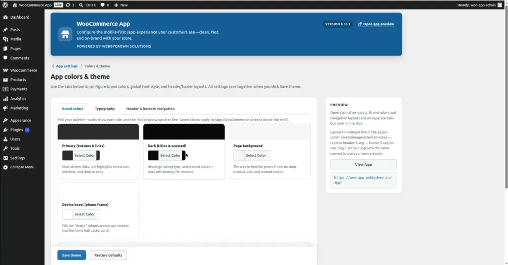
Customize the visual design of your /app mobile store – set brand colors, choose a font style, and pick header and bottom navigation layouts. All settings are on one page and save together with a single click.
Where to Find It
Location: Go to WooCommerce → App in your WordPress admin. On the App hub, click “Colors & theme”. Or go directly to WooCommerce → App → Theme.
The page is organized into three tabs: Brand colors, Typography, and Header & bottom navigation. All three tabs save together when you click “Save theme”.
Tab 1 – Brand Colors
The Brand Colors tab controls the four core colors used across all /app screens – shop, product pages, cart, checkout, and account. You use a color picker or type a hex code to set each one. A live mini-preview updates as you choose colors so you can see how they look together before saving.
| Setting Name | What It Controls | Where It Appears | Default |
|---|---|---|---|
Primary (buttons & links) |
Your main brand color – used for all action buttons, links, and highlighted UI elements |
Add to Cart buttons, links in text, active icon highlights, and checkout call-to-action buttons |
#2271b1 |
Dark (titles & pressed) |
A deeper shade of your brand – used for headings, strong text, and pressed/active states. Pairs with Primary for contrast. |
Product titles, section headings, pressed button states, and nav text |
#003c68 |
Page background |
The background color of the app content area – the surface behind product cards, shop grid, and all inner screens |
Behind product grid on /app/shop, behind product detail on /app/product/…, behind cart, checkout, and account screens |
#d8e6f2 |
Device bezel (phone frame) |
The outer chrome color that wraps around the app content. This is the “device” column visible on the sides when viewing /app on a desktop browser. |
The band around the phone-frame column on desktop viewports. Not visible on actual mobile phones. |
#e9f2fa |
Live palette preview: The right side of the Brand Colors tab shows a live mini-preview with three color swatches – Primary, Dark, and the Accent blend (a mid-tone automatically mixed from your Primary and white). This preview updates instantly as you adjust colors – no need to save first to see how they look together.
Tab 2 – Typography
The Typography tab lets you change the font used inside /app. By default, the app inherits the font from your WordPress theme. You can override it with a built-in web font or upload your own custom font file.
| Setting | What It Does | Options / Notes |
|---|---|---|
Enable custom app font style |
Toggle switch that activates custom typography. When OFF, the app uses your WordPress theme’s font. |
ON / OFF toggle. Must be ON to use any of the settings below. |
Font family |
Choose a built-in web font to use across all /app text – headings, body, prices, buttons, and labels. |
Dropdown list of available font choices (e.g. Poppins, Inter, Roboto, etc.). A live typography preview below the dropdown updates when you change the selection. |
Upload font file |
Upload your own custom font file if your brand uses a proprietary typeface. |
Supported formats: .ttf, .woff, .woff2, .otf. Click “Upload Font” to open the WordPress media uploader. |
Uploaded font selector |
Once a font is uploaded, it appears here. Select it to apply it to the app. |
Only shown after you upload a font. To replace, upload a new file. |
Live typography preview: Below the font controls, a preview panel shows how your selected font looks in different text styles – a heading, body paragraph, a price, and an “Add to cart” button. This previews in your browser before you save.
Font must be enabled: The “Enable custom app font style” toggle must be turned ON for your font choice to apply. If the toggle is OFF, the app uses your theme’s default font regardless of what font you selected.
Tab 3 – Header & Bottom Navigation
The third tab controls the visual style of the top bar (header) and the bottom tab bar (footer navigation). There are also two additional header options – sticky header and center logo.
| Setting | What It Controls |
|---|---|
Sticky header |
Toggle ON/OFF. When ON, the top bar stays visible as the customer scrolls down – it does not scroll out of view. Recommended for navigation-heavy stores. |
Center logo |
Toggle ON/OFF. When ON, your store logo in the header is centered instead of left-aligned. Good for minimalist or fashion store styles. |
Header logo |
Upload a custom image to use as the store logo in the app top bar. Click to open the WordPress Media Library. Use a PNG with a transparent background for best results. |
Top Bar (Header) – 5 Layout Presets
Choose one of five visual styles for the top bar that appears at the top of every /app screen:
| # | Preset Name | Visual Style |
|---|---|---|
1 |
Storefront card |
Inset white panel on the home screen; inner screens use a soft “card” bar with a large rounded bottom edge. The default style – clean and modern. |
2 |
Sunset gradient |
A bold multi-stop primary color gradient across the full bar width, light text, and glassy icon buttons. Feels like a promo strip – high-energy and brand-forward. |
3 |
Wireframe outline |
Transparent bar with a dashed underline, outline-only circle controls, and a small uppercase title. Minimal and editorial. |
4 |
Midnight glass |
Dark frosted bar with light text – high contrast “night mode” chrome. Works well for stores with dark or luxury branding. |
5 |
Orbit pill |
A fully floating capsule with a double-rim shadow and pill-shaped corners. Clearly separated from the page behind it – eye-catching and modern. |
Bottom Tab Bar (Navigation) – 5 Layout Presets
Choose one of five visual styles for the bottom navigation bar that customers use to switch between Home, Shop, Cart, Search, and Account:
| # | Preset Name | Visual Style |
|---|---|---|
1 |
Nebula pill |
A gradient-filled floating capsule with a glowing gradient pill behind the active tab. The default style – modern and app-like. |
2 |
Metro rail |
Tall full-width dock with large icons, uppercase labels, and a colored notch above the active tab. Bold and easy to tap. |
3 |
Spotlight icons |
Icon-only row (text labels are screen-reader only) with oversized icons and a soft glow disc behind the active tab. Clean and minimal. |
4 |
Harbor shelf |
Wide bottom shelf with pronounced top rounding and a vertical gradient – reads like a lifted platform. Good for stores with a strong structural visual style. |
5 |
Segmented tray |
An embossed gray tray with four molded segments. The active tab pops up as a white tile with a shadow. Feels tactile and grouped. |
How to Save
1. Go to WooCommerce → App → Theme (Colors & theme)
The page opens on the Brand Colors tab by default.
2. Set your Brand Colors (Tab 1)
Click each color card to open the color picker. Choose your Primary color first – it drives most of the app’s look. Set Dark, Page background, and Device bezel to complement it. Watch the live preview on the right update.
3. Optionally set Typography (Tab 2)
Click the “Typography” tab. Toggle on “Enable custom app font style” if you want to change the font. Choose from the dropdown or upload a custom font file.
4. Optionally adjust Header & Navigation (Tab 3)
Click the “Header & bottom navigation” tab. Toggle sticky header or center logo if needed. Upload a logo image, then select a top bar preset and a bottom tab bar preset.
5. Click "Save theme"
The Save theme button saves all three tabs at once. You will see a green success message confirming the save.
6. Open /app on your phone to preview
After saving, open your store URL followed by /app on a real phone. Check all screens – home, shop, a product page, and cart – to confirm the colors and layouts look right.
Tips for a Professional Look
- Start with your Primary color – pick your main brand color here, then let the other settings flow from it. Dark should be a deeper shade of the same hue.
- Use the live palette preview on the Brand Colors tab to see how your colors look together before saving – it updates instantly as you adjust pickers.
- For the Page background, a very light tint of your Primary color (near-white) looks professional and keeps the focus on your products.
- Test your chosen Header preset on a real phone – some styles look different on mobile screens than on desktop.
- The Device bezel color is mostly visible on desktop browsers when viewing /app. On actual mobile phones it is not visible, so it is less critical to get perfect.
- If you upload a header logo, use a PNG with a transparent background so it works on any header background color.
- You can reset colors to plugin defaults by clicking “Reset to defaults” if you want to start over without manually typing old values.
Image