


Control the visual layout of every major screen inside /app – the product catalog grid, single product pages, shopping cart, checkout, and customer account. All five screens have their own preset choices and save together with one click.
Where to Find It
Location: Go to WooCommerce → App and click “Shop Grid” on the hub page. Or navigate directly to WooCommerce → App → Shop Grid.
The admin page is titled “Catalog, product page, cart, checkout & account”. It has five tabs – one for each screen inside the app. You configure each screen separately, and all settings save together when you click “Save layout”.
Tab 1 – Shop Catalog
Controls how products appear on the /app/shop page and in all product grids throughout the app.
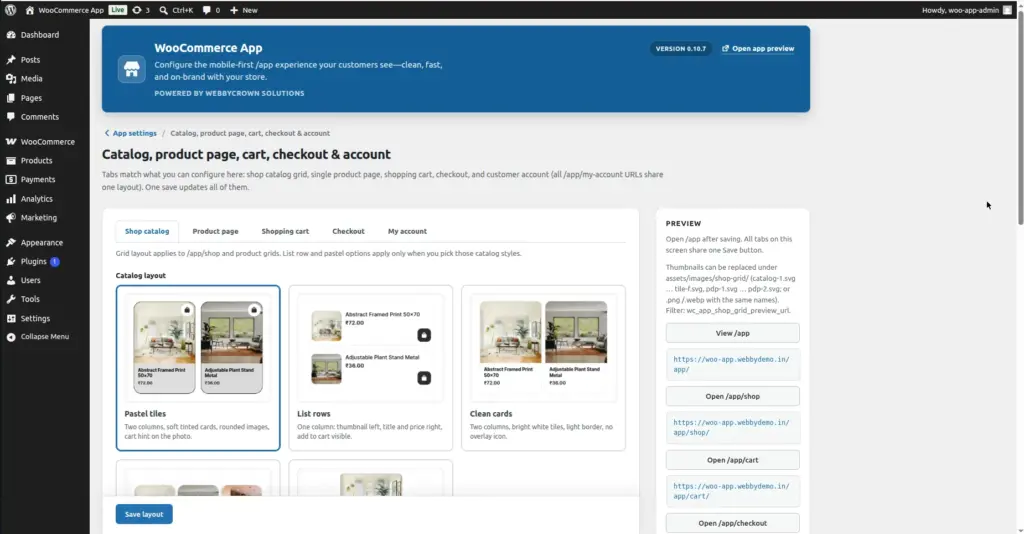
Catalog Layout – Choose 1 of 5 Presets
| # | Preset Name | Grid Style | Best For |
|---|---|---|---|
1 |
Pastel tiles |
Two-column grid with soft tinted card backgrounds, rounded product images, and a cart hint icon overlaid on the photo. |
Fashion, gifts, lifestyle – visually engaging stores where the product image is the main selling point. |
2 |
List rows |
Single-column layout – product thumbnail on the left, title and price on the right, with an “Add to cart” button visible on each row. |
Stores where product names or prices need to be clearly readable – electronics, books, technical products. |
3 |
Clean cards |
Two-column grid with bright white tiles, a subtle light border, and no overlay icon. Minimal and modern. |
General-purpose stores wanting a clean, professional look without colorful card backgrounds. |
4 |
Compact grid |
Three smaller columns – tighter spacing, catalogue-style density. Shows more products per screen. |
Stores with very large catalogues where showing more products at once is more valuable than large images. |
5 |
Hero + grid |
The first product in the list spans the full screen width with a large image; all remaining products display in a two-column grid below it. |
Highlighting one featured or new product at the top while keeping the rest in a standard grid. |
List Row Arrangement (Sub-option for Layout 2 only)
This setting only applies when you have selected “List rows” as your catalog layout. It controls how each row inside the list is arranged:
| Option | Description |
|---|---|
A – Center + top-right cart |
Product title, price, and rating are centered in the text area. The cart icon is fixed to the top-right corner of the row. |
B – Left stack + cart below |
All text (title, price, rating) is left-aligned and stacked. The cart icon appears below the price, end-aligned to the right. |
Pastel Tile Look (Sub-option for Layouts 1 and 4)
This setting applies when you have selected “Pastel tiles” (Layout 1) or “Compact grid” (Layout 4). It controls the specific visual style of the card tiles – the background tint color, corner rounding, image framing, and cart icon style. Several tile style variations (A through F) are available, each with a different look and feel. Choose the one that best matches your store’s aesthetic.
Image
Tab 2 – Product Page
Controls the layout of individual product pages at /app/product/[product-slug]. Your main WordPress theme product template is not changed – this setting only affects how products appear inside the app shell.
| # | Preset Name | Layout Style | Best For |
|---|---|---|---|
1 |
Standard |
Classic product page layout: image gallery with thumbnail strip at the bottom, followed by title, price, short description, and the Add to Cart / variation selector – all stacked vertically. The default app product page style. |
Most stores – clean, familiar layout that customers recognize from standard WooCommerce. |
2 |
Showcase card |
A larger image gallery on a soft gray background. A white detail card “slides up” over the bottom of the image, displaying a bold price row, a compact quantity selector, and a full-width CTA button. The product image takes up more of the screen for visual impact. |
Fashion, jewelry, premium products, or any store where product photography is a key selling point. |
Tab 3 – Shopping Cart
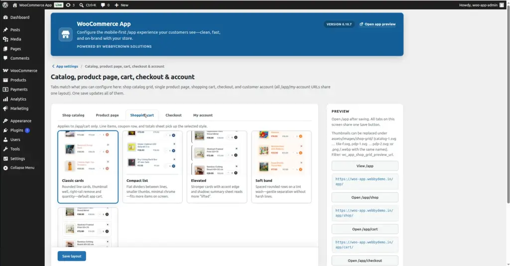
Controls the visual style of the cart screen at /app/cart. This affects how cart line items, the coupon input row, and the order totals sheet are displayed.
| # | Preset Name | Style Description |
|---|---|---|
1 |
Classic cards |
Rounded card for each cart item, with a product thumbnail well, a remove button on the right, and a quantity selector. The default app cart style. |
2 |
Compact list |
Flat horizontal dividers between cart items (no card borders), smaller thumbnails, and minimal chrome. Fits more items on screen at once – good for stores where customers typically buy multiple items. |
3 |
Elevated |
Stronger card styling with an accent-color left edge and a stronger shadow. The totals summary sheet reads more “lifted” from the page. More visual emphasis on each cart item. |
4 |
Soft band |
Spaced rounded rows on a tinted wash background, with gentle separation between items (no harsh borders). A soft, comfortable feel. |
5 |
Wireframe |
Dashed-outline cart item rows, flat thumbnails with a simple border rim, and an airy editorial layout. Minimal and sketch-like – good for creative or design-focused stores. |
Image
Tab 4 – Checkout
Controls the layout and visual style of the checkout screen at /app/checkout. This uses the classic WooCommerce checkout form inside the app shell.
| # | Preset Name | Style Description |
|---|---|---|
1 |
Standard |
Default app checkout: white panels, standard border radius, and soft shadows from the main stylesheet. Clean and neutral – works with any brand color. |
2 |
Dense gray |
Cool gray page background, flat white content blocks with no drop shadows, and uppercase micro-labels on form fields. Feels like a tight, focused utility form – clinical and efficient. |
3 |
Floating studio |
Gradient backdrop, very rounded “floating” cards with heavy shadows, pill-shaped payment option rows, and a bold full-width pay button. Premium, app-store feel. |
4 |
Frosted wash |
Tinted gradient page background with translucent (frosted glass) panels, blurred backdrop behind cards, and soft accent-tinted input fields. Modern and elegant. |
5 |
Brand rail |
A warm tint derived from your accent color, a thick left stripe on every content block, slightly skewed card corners, and an emphasized payment method selection area. Strongly on-brand visual style. |
Tab 5 – My Account
Controls the layout of the My Account section – all screens under /app/my-account, including Orders, Addresses, Edit Account, and individual Order detail pages. All account endpoints share one layout setting.
| # | Preset Name | Style Description |
|---|---|---|
1 |
Standard |
Default app account layout: content displayed first, vertical navigation cards below, soft shadows – matches the main app stylesheet. The most neutral and universally compatible option. |
2 |
Dense utility |
Cool gray canvas, flat white blocks with smaller border radius and no drop shadows. Tight, admin-style panels – efficient and functional. |
3 |
Top chips |
Horizontal pill-shaped navigation links displayed at the top of the account screen (wrap to multiple lines or scroll horizontally), then page content below. Feels like tab segment controls on iOS apps. |
4 |
Frosted studio |
Gradient wash background with translucent frosted navigation and content panels, blur effect, and larger rounded corners. Premium, modern visual style. |
5 |
Brand rail |
Accent-color-tinted page background with a bold left rail on navigation items and content blocks – aligned with the checkout “Brand rail” preset for a consistent branded experience across cart and account. |
How to Save
1. Go to WooCommerce → App → Shop Grid
The page opens on the Shop Catalog tab by default.
2. Choose your catalog layout (Tab 1)
Click on the radio card for the catalog layout you want. If you chose “List rows”, also select a List row arrangement (A or B). If you chose “Pastel tiles” or “Compact grid”, optionally choose a Pastel tile look style.
3. Choose your product page layout (Tab 2)
Click the “Product page” tab and select either Standard or Showcase card.
4. Choose your cart, checkout, and account layouts (Tabs 3–5)
Click through each remaining tab and select the preset that best matches your store’s style. You can mix different styles across screens – for example, “Elevated” cart + “Frosted wash” checkout.
5. Click "Save layout"
One button saves all five tabs at once. A green success notice confirms the save: “Layouts saved. Preview /app/shop, a /app/product/… URL, /app/cart, /app/checkout, and /app/my-account.”
6. Preview each screen on your phone
After saving, check /app/shop, open a product, add it to cart, and navigate through checkout and account. Confirm each screen looks right.
Tips
- The Pastel tiles (Layout 1) and Clean cards (Layout 3) catalog presets are the most popular – both use a two-column grid that is optimal for most mobile stores.
- Use List rows (Layout 2) if your products have long names or important details that need to be readable at a glance – e.g. technical specifications, book titles, or ingredient names.
- The Showcase card product page layout works especially well when combined with high-quality product photography – the larger gallery makes strong images the star of the page.
- Try to use a consistent visual style across tabs – for example, the “Brand rail” and “Frosted wash” presets are available in both Checkout and My Account, making it easy to create a cohesive look for the purchase journey.
- After saving, use the “Open /app/shop”, “Open /app/cart”, and “Open /app/checkout” buttons in the sidebar to quickly preview each screen without navigating manually.