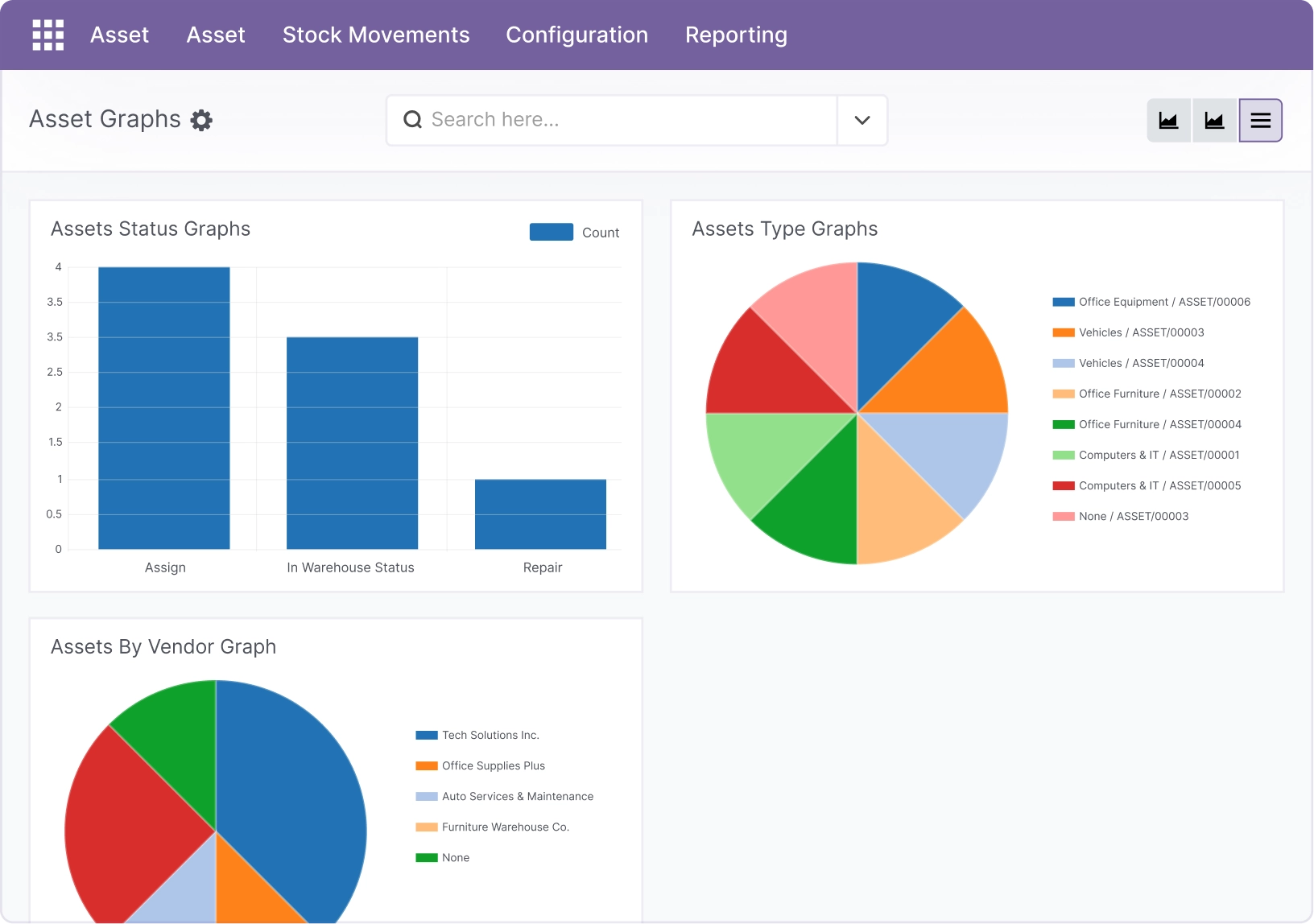
The Reporting menu provides charts to help you understand your asset landscape quickly: what you own, where it is, who it’s assigned to, and where costs are coming from.
Overview
Go to Asset → Reporting. You’ll see chart shortcuts such as:
- Asset Type (distribution by type)
- Asset By Vendor (distribution by supplier)
- Asset By Status (assigned, in warehouse, repair, etc.)
- Asset Transfer (transfer activity over time)
- Asset Maintenance (maintenance costs over time)
- Asset Depreciation (depreciation amounts over time)
Access note: Reporting is often visible only to administrators.
How it works
- Charts use the data you enter in Assets, Transfers, Maintenance, and Depreciation.
- Better data = better charts. Missing fields can make charts less useful.
- Charts are best for trends and quick checks, not detailed audits.
Step-by-step guide
Open a chart
Go to Asset → Reporting and click the chart you want.
Interpret the result
Look for “big slices” or “spikes” — they show what needs attention (example: many assets in Repair).
Drill down using filters
If available, use filters, date ranges, and groupings to narrow the view.
Fields table
| Chart | Description | Example |
|---|---|---|
Asset Type |
Shows how assets are distributed by type. |
Computers & IT = 40% |
Asset By Vendor |
Shows which vendors supplied most assets. |
Tech Solutions = largest slice |
Asset By Status |
Shows assets by lifecycle stage/status. |
Repair spike this month |
Asset Transfer |
Shows transfer activity over time. |
High assignments during onboarding |
Asset Maintenance |
Shows maintenance costs over time. |
Costs rising for vehicles |
Asset Depreciation |
Shows depreciation amounts over time. |
Year‑end depreciation peak |
Field explanations (what users usually ask)
| Field Name | Explanation |
|---|---|
Asset Type |
Distribution of assets by type; reveals which categories dominate your inventory. |
Asset By Vendor |
Breakdown by supplier; most accurate when vendor names are standardized and deduplicated. |
Asset By Status |
Count of assets by lifecycle stage (Assigned, In Warehouse, Repair, etc.) to spot operational bottlenecks. |
Asset Transfer |
Volume of assignments/returns over time; helpful for onboarding seasons and utilization trends. |
Asset Maintenance |
Maintenance spend over time; quickly highlights costly periods, assets, or vendors. |
Asset Depreciation |
Depreciation amounts over time; useful for year-end reviews and value forecasting. |
Tips
- Use tags + types consistently to make charts meaningful.
- Maintain transfer dates so time‑based charts look correct.
- Review monthly to catch unusual trends early.
Common mistakes
- Expecting charts to fix bad data: charts reflect whatever is entered.
- Duplicate vendors or types: splits charts and hides the real picture.
- Ignoring “Repair” or “On Hold” counts: these often signal process issues.
Image placeholder