Pick a modern login page style that fits your brand.
Overview
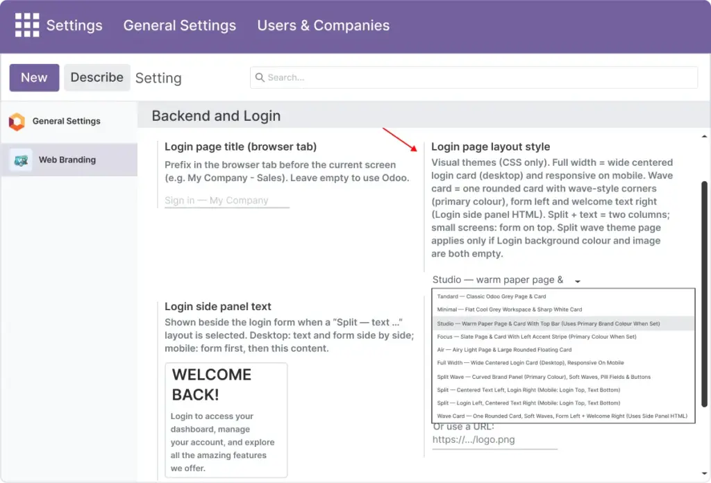
The Login page layout style field switches between several pre-built visual designs for /web/login. Each option changes layout, spacing, card shape, and background treatment while keeping the same login behavior (database, email, password, optional OAuth).
Styles range from close-to-default Standard to full split-screen marketing layouts. Split and wave-style layouts can show Login side panel text next to or around the form; other styles focus only on the card.
You can change the layout at any time. After saving, always preview on desktop and mobile because stacking order and panel width differ by style.
How It Works
Web Brand applies the selected style through CSS and template structure shipped with the module. Your Backend primary color (and related branding) is often reused in split and wave designs for panels and accents.
Some layouts show a decorative page background only when you have not set both a custom Login background color and Login background image; otherwise your background settings take priority.
Login side panel text is ignored visually on layouts that do not include a side panel (for example Standard or Minimal), but the HTML is still stored-you do not lose content when switching layouts.
Step-by-Step Guide
- Open Login page (public) in Web branding settings.
- Choose a style from Login page layout style.
- For Split or Wave card layouts, edit Login side panel text.
- Save and open /web/login in a private window.
Fields Table
| Layout name | Description | Best for |
|---|---|---|
Standard |
Classic Odoo grey page and card |
Minimal change |
Minimal (Soft) |
Flat grey workspace, sharp white card |
Clean corporate |
Studio (Elevated) |
Warm page, card with top accent bar |
Professional services |
Focus |
Slate page, card with left accent stripe |
Strong brand accent |
Air |
Light page, large rounded floating card |
Modern SaaS feel |
Full width |
Wide centered card on desktop |
Hero-style login |
Split wave |
Curved brand panel, pill fields |
Bold marketing look |
Split – text left |
Welcome text left, form right |
Storytelling (default) |
Split – text right |
Form left, welcome text right |
Logo-first layouts |
Wave card |
One rounded card, form + welcome inside |
Premium app login |
Field Explanations
Layout name
One of the choices in the Login page layout style dropdown; pick the row that matches what you selected in Odoo.
Best for
Typical use case so you can shortlist styles before testing on /web/login.
Login page layout style
The Odoo field that applies the selected design to the public login route. Visual only; credentials and authentication behavior stay the same. Change any time after saving.
Standard
Classic Odoo grey page with a centered card-closest to default Odoo with light Web Brand styling.
Minimal (Soft)
Flat grey workspace with a sharp white card for a clean, corporate look with little decoration.
Studio (Elevated)
Warm page tone and a card with a top accent bar; suits professional services and polished brands.
Focus
Slate page with a card that has a left accent stripe; strong single accent color next to the form.
Air
Light page with a large rounded floating card; feels like a modern SaaS product login.
Full width
Wide centered card on desktop for a hero-style login with more horizontal presence.
Split wave
Curved brand panel with pill-shaped fields; bold marketing-led appearance.
Split – text left
Welcome or marketing copy on the left, form on the right; good for storytelling (often the default split).
Split – text right
Form on the left, text panel on the right; useful when the logo or headline should lead on the left side.
Wave card
Single rounded card containing both form and welcome content; compact “premium app” layout.
Tips
- Tip: Set Backend primary color before judging split or wave layouts so brand panels match your palette.
- Tip: Open
/web/loginin a private window after each change so you are not affected by cached assets or an old session. - Tip: Shortlist two or three layouts from the table, then A/B them with real logo and background for a fair comparison.
Common Mistakes
- Mistake: Choosing a split or wave layout but leaving Login side panel text empty or full of placeholder Latin, which wastes the marketing space.
- Mistake: Assuming the side panel appears above the form on phones-on small screens the form often stacks first; check a real device width.
- Mistake: Changing layout without re-checking contrast when a dark background image is enabled; some layouts assume a lighter page.
Image